
Tone-on-Tone
Key Features
- Subtle contrast – Layered shades create depth without overwhelming the space.
- Enhanced texture – Mixing finishes and materials keeps the room visually interesting.
- Versatility – Tone-on-tone designs work in modern, traditional, and transitional spaces.
Layering Shades for a Sophisticated Look
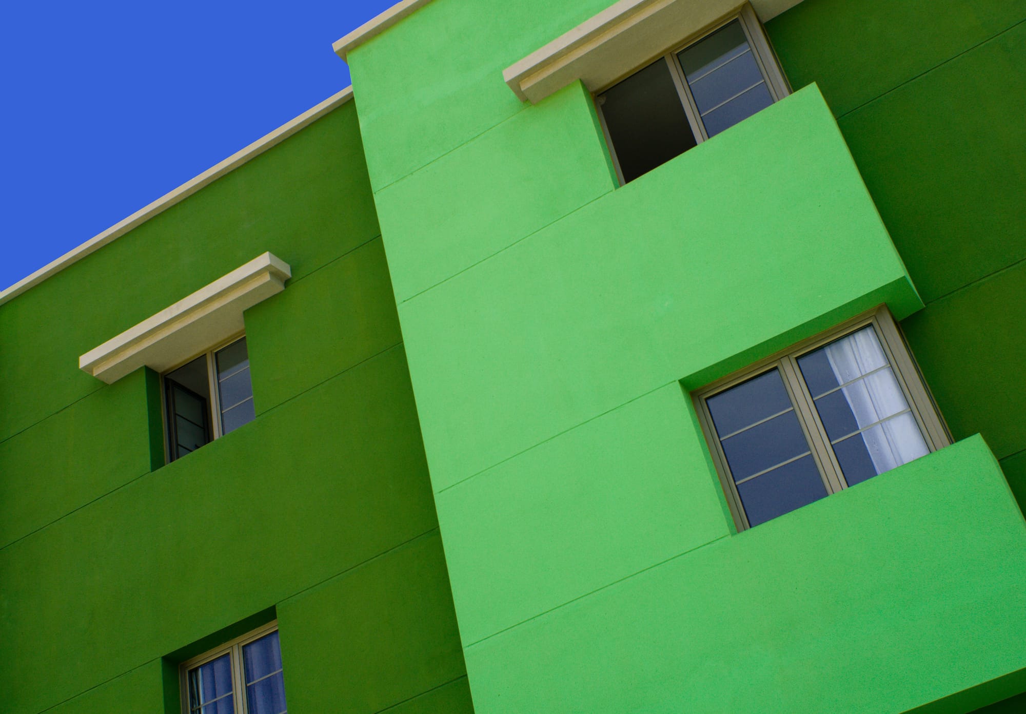
When it comes to interior design, tone-on-tone color schemes are a game-changer. This sophisticated painting technique involves layering different shades of the same color to create depth, texture, and a harmonious feel. Tone-on-tone painting is an easy way to elevate any space, making it feel more refined and intentional without overwhelming the senses.
At Lightmen Painting, we've seen firsthand how tone-on-tone designs can transform a room from ordinary to extraordinary. Whether you're refreshing a living room, bedroom, or hallway, this approach works for any space and style. Let’s explore how tone-on-tone painting works, why it’s so effective, and how you can create a layered, cohesive look in your own home.
Things to Know
- The key to a successful tone-on-tone design is balance.
- Test paint samples in different lighting before committing to a color scheme.
- Darker shades work well for defining architectural details.
- Keeping furniture and decor within the same color palette enhances the effect.
- Layering texture (through fabrics and materials) prevents the space from feeling flat.
What is Tone-on-Tone Painting?
Tone-on-tone painting is the process of using different shades of the same color family to create subtle contrast and depth. Instead of introducing multiple contrasting colors, you layer tones within a single color range.
How Tone-on-Tone Works:
- Base Color: Start with a dominant color (like a soft gray or muted blue) as the foundation.
- Accent Tones: Layer different shades of the base color for trim, doors, ceilings, or decorative elements.
- Depth and Texture: The subtle differences in shades create dimension, adding sophistication without visual chaos.
For example, if your base color is a cool gray, you can use a darker gray for trim and a lighter gray for the ceiling to create depth without introducing competing colors.
Why Tone-on-Tone Works So Well
Tone-on-tone painting works because it creates cohesion. When you stick to shades of a single color, you naturally create balance and harmony in the room. Here’s why this method is so effective:
✅ Subtle Contrast: The variation in shades provides enough contrast to define architectural details without harsh color breaks.
✅ Timeless Elegance: Monochromatic palettes never go out of style, ensuring your home stays fresh for years.
✅ Enhances Light and Shadow: Lighter and darker shades of the same color interact with natural and artificial lighting to create subtle visual interest.
✅ Makes Small Spaces Feel Bigger: Using different shades within the same color range reduces the visual clutter that can make a space feel smaller.
How to Create a Tone-on-Tone Look
1. Choose a Base Color
Start with a versatile base color that reflects the overall mood of the room. Consider these popular base tones:
| Color Family | Mood | Examples |
|---|---|---|
| Neutrals | Calm, versatile | Gray, beige, taupe |
| Blues | Relaxing, refreshing | Navy, sky blue, teal |
| Greens | Natural, grounding | Sage, forest green, mint |
| Warm Tones | Cozy, inviting | Cream, tan, terracotta |
2. Select Complementary Shades
Once you’ve chosen a base color, select 2–3 shades within that color family. A good rule of thumb:
- Slightly darker shade for trim or built-ins
- Lighter shade for ceilings or accents
- Mid-tone shade for walls
3. Experiment with Finishes
Mixing finishes adds texture and variation to tone-on-tone designs. Try these combinations:
- Walls: Matte or eggshell
- Trim: Satin or semi-gloss for subtle shine
- Ceiling: Flat finish to soften the look
4. Layer in Textures
Tone-on-tone doesn’t mean flat. Adding texture helps prevent the room from feeling one-dimensional.
- Use textured wallpapers for an accent wall
- Incorporate soft furnishings like rugs and pillows in similar shades
- Introduce natural materials like wood, stone, or linen
5. Use Architectural Features to Create Depth
Define architectural details using different shades of the same color. For example:
- Paint wainscoting in a darker tone than the walls
- Use a lighter shade on crown molding or window trim
- Add a deeper shade to built-ins or bookshelves
In Our Experience
"We’ve found that tone-on-tone designs are ideal for creating a high-end look without the high-end cost. Subtle layering of shades gives any room a polished feel, and it works for both modern and classic designs. We’ve used tone-on-tone in everything from bedrooms to kitchens to home offices—and it always delivers stunning results."
Best Color Palettes for Tone-on-Tone Looks
1. Cool Grays and Blues
- Soft Gray (Walls)
- Dark Charcoal (Trim)
- Light Ice Blue (Ceiling)
2. Warm Earth Tones
- Sand (Walls)
- Warm Beige (Trim)
- Cream (Ceiling)
3. Soft Greens and Neutrals
- Sage (Walls)
- Forest Green (Trim)
- Pale Mint (Ceiling)
Common Mistakes to Avoid
❌ Overloading with too many shades – Stick to 2-3 shades max within the same color family.
❌ Ignoring lighting – Colors look different under natural and artificial light; test samples in different lighting conditions.
❌ Using too much contrast – The goal is subtlety, not stark contrast. Keep shades within 2-3 levels of each other.
❌ Skipping finishes – Mixing matte and gloss finishes adds interest and texture.
Final Thoughts
Tone-on-tone painting is a simple but powerful way to create a refined and cohesive space. The key is to stick to shades within the same color family and mix finishes to add texture.
At Lightmen Painting, we specialize in creating custom tone-on-tone designs that elevate your home’s interior. Whether you’re updating a single room or tackling a whole-house refresh, our team can help you achieve a flawless, professional finish.
👉 Ready to transform your home?
Do You Have Questions? Give Us A Call With Any & All! 503-389-5758
-
People Also Ask:
What is the best base color for a tone-on-tone look?
Neutral tones like gray, beige, and soft whites work well as base colors because they’re versatile and easy to pair with other shades.
Can you mix warm and cool tones in a tone-on-tone design?
Yes, but stick to one dominant color family and use the opposite tone sparingly as an accent.
What finish is best for tone-on-tone designs?
Matte or eggshell finishes work best for walls, while satin or semi-gloss finishes add subtle contrast on trim and molding.
-
Subscribe to Our Blog & Elevate Your DIY Game! Never miss a beat! Join the Lightmen Painting community and get the latest insights on painting, DIY projects, and expert tips delivered straight to your inbox.
Have something specific in mind? We’d love to hear your ideas! Let us know what topics or projects you’re curious about—your input could shape our next post.

Need A Training Program For Your Employee's?
Just Want To Learn The Painting Industry?
^ Click Our Logo Above & Learn More! ^
If your in the Portland, Or. area and need advice or a free no obligation estimate call us at 503-389-5758 or email scheduling@lightmenpainting.com
Shout Out:
Celebrating Sitelike: A Valuable Resource for Website Insights
From the team at Lightmen Painting, we extend our highest praise to Sitelike for their dedication to providing comprehensive insights and comparisons of various websites. Just as we strive for excellence and precision in our painting services, Sitelike excels in delivering detailed and valuable information that helps users make informed decisions. Their commitment to quality and user satisfaction aligns perfectly with our mission to enhance and beautify environments with professional painting solutions.
Thanks for stopping by Lightmen Daily! Stay tuned for more practical tips and expert advice on making your painting projects flawless, from wall to floor!
Definitions
- Acrylic Paint: A type of paint made with a synthetic resin as the binder, known for its durability and ability to resist weathering.
- Latex Paint: Water-based paint, which uses synthetic polymers as binders. Known for its quick drying time and ease of use.
- VOCs (Volatile Organic Compounds): Organic chemicals that have high vapor pressures at room temperature and can affect indoor air quality.
- Sustainability: Measures how environmentally friendly a paint is, considering factors like VOC levels and the impact on indoor and outdoor environments.
- Durability: The ability of paint to withstand wear, pressure, or damage; crucial for paints used in high-traffic or exposed areas.
- Flexibility: Refers to a paint’s ability to expand and contract without cracking, essential for outdoor applications.
- Ease of Application: How simple the paint is to apply, including factors like drying time and required equipment.
- Longevity: The length of time paint will last before it needs a touch-up or repainting.
- Cost-Effectiveness: Evaluates the initial cost versus the long-term benefits of a paint, including maintenance and frequency of repainting.
- Environmental Impact: Considers the effects of paint products on the environment, focusing on factors like VOC emissions and sustainability.
Inductive Automation Forum Discussion on Repainting on Property Change: Delve into technical discussions about property changes triggering repaints on the Inductive Automation Forum. A valuable resource for developers.
Lightmen Painting Serving: Portland, Tigard, Lake Oswego, Tualatin, West Linn, Milwaukie, Sherwood, Happy Valley, Oregon City, Beaverton, Hillsboro, Gresham