
Revamping Your Office Space: Colors that Boost Productivity
Key Highlights
- The psychological impact of colors on mood and productivity.
- Best color choices for different office functions.
- Practical tips for implementing effective office color schemes.
- Lightmen Painting’s personalized approach to office painting projects.
Colors that Boost Productivity
Understanding the Psychology of Colors in the Workplace
Choosing the right colors for your office space can significantly influence employee productivity and morale. We've seen firsthand how a well-thought-out color scheme can transform a dull workspace into an inspiring environment. Let’s dive into how different colors affect mood and productivity, and how you can strategically use them in various parts of your office.
The Impact of Color on Mood and Productivity
Colors have a profound impact on our emotions and behavior. Understanding this psychology can help you create a workspace that enhances productivity and fosters a positive atmosphere.
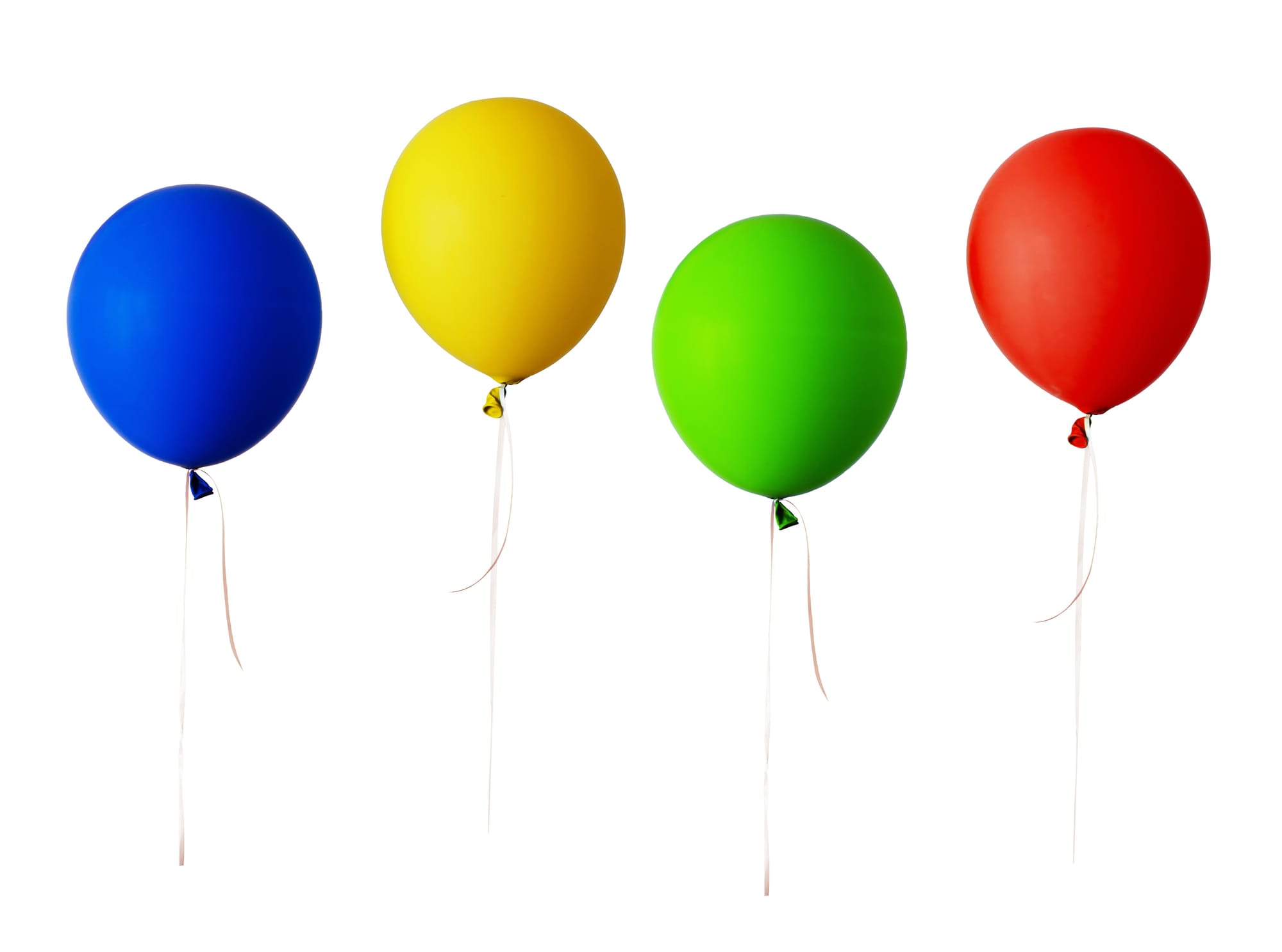
Blue for Calm and Focus: Blue is known for its calming effects. It helps reduce stress and anxiety, making it an excellent choice for areas where employees need to focus and concentrate. Think of spaces like private offices or study rooms. I once worked on an office project where we painted the main work area in a soft blue shade, and the client reported a noticeable increase in focus and calmness among the employees.
Yellow for Creativity and Energy: Yellow is a vibrant color that stimulates creativity and energy. It’s perfect for brainstorming rooms or creative departments. A splash of yellow can invigorate the space, making it a dynamic environment that encourages innovative thinking.
Red for Energy and Passion: Red is a powerful color that can evoke strong emotions and increase heart rates. It’s great for areas where a high level of activity and energy is desired, such as sales floors or fitness centers. However, use it sparingly as too much red can be overwhelming.
Green for Balance and Innovation: Green is associated with nature and tranquility. It promotes balance and harmony, making it an ideal color for meeting rooms where collaboration and innovation are key. In a project we completed for a tech startup, green meeting rooms became the favorite spots for team brainstorming sessions.
Choosing Colors Based on Office Function
Different areas of your office can benefit from specific color schemes tailored to their function.
Reception and Waiting Areas
The reception area is the first impression visitors get of your business. Soft, welcoming colors like light blues or greens can make a positive impact. Adding a feature wall in a bold color like orange can also create a focal point and make the space more inviting.
Workstations
For individual workstations, colors that promote concentration and calmness are ideal. Shades of blue or green can help employees stay focused and reduce stress levels. Incorporating accent colors through furniture or décor can add visual interest without being distracting.
Meeting Rooms
Meeting rooms are spaces for collaboration and decision-making. Green is an excellent choice here as it fosters innovation and calm discussions. Another effective strategy is to use neutral colors like beige or grey and add bright accents through artwork or furniture to create a balanced yet stimulating environment.
Best Colors for Office Productivity
Blue – The Focus Enhancer
Blue is known for its calming properties, which can significantly enhance focus and reduce stress levels. This makes it an ideal choice for environments where concentration is key. Picture a finance office, where employees need to focus on intricate details and numbers for extended periods. Painting the walls in shades of blue can help create a serene environment that minimizes anxiety and distractions.
I once worked on a project where we transformed a finance office with a calming blue palette. The change was remarkable. Employees reported feeling more focused and less stressed, which positively impacted their productivity and overall job satisfaction. The subtle, cool tones of blue provided the perfect backdrop for intense concentration without being overwhelming.
Green – The Balancer
Green is another fantastic color for office spaces, particularly because it promotes a sense of balance and calm. It’s also known to reduce eye strain, which is crucial for employees who spend long hours at their desks. Incorporating green into your office design can help create a refreshing atmosphere that feels both natural and tranquil.
Imagine a tech company where developers and designers spend most of their day in front of screens. By adding green elements—whether it’s through wall paint, plants, or décor—you can create a soothing environment that mitigates the fatigue associated with prolonged screen time. In one of my projects, we used varying shades of green to redesign a client’s workspace, and the feedback was overwhelmingly positive. Employees felt more relaxed and refreshed, which translated to increased productivity and fewer complaints about eye strain.
Yellow – The Energizer
Yellow is a color that exudes energy and stimulates creativity. It’s perfect for areas where brainstorming and innovative thinking are encouraged, such as marketing departments or creative studios. Yellow can inspire enthusiasm and positivity, making it easier for teams to come up with fresh ideas and solutions.
In a marketing firm I collaborated with, we painted the brainstorming room in a bright, cheerful yellow. The transformation was immediate. The room became a hub of creativity, and team members felt more energized and excited to contribute their ideas. Yellow’s vibrant presence acted as a catalyst for innovative thinking, turning a previously dull space into a dynamic and inspiring environment.
Red – The Stimulator
Red is a powerful color that can evoke strong emotions and stimulate energy and excitement. It’s particularly effective in spaces where high levels of activity and motivation are needed, such as sales offices. Red can increase heart rate and create a sense of urgency, which can drive performance and enthusiasm.
However, it’s essential to use red strategically. Overdoing it can lead to feelings of aggression or anxiety. In a sales office I revamped, we used red accents sparingly—on trim, furniture, and feature walls—to inject energy without overwhelming the space. The result was a noticeable boost in the team’s drive and competitiveness, aligning perfectly with the high-energy demands of a sales environment.
Colors to Avoid in Office Spaces
Overly Dark or Intense Colors
While some bold colors can stimulate productivity, overly dark or intensely bright colors can have the opposite effect. Colors like black or neon shades can be distracting, overwhelming, and even depressing. They can create a heavy atmosphere that hampers focus and reduces morale.
Neutral Overload
While neutrals like beige, gray, and white can provide a clean, professional look, using them excessively can result in a bland and uninspiring environment. An overload of neutral tones can make an office feel sterile and devoid of energy, which can dampen creativity and motivation.
In another project, a client’s office was dominated by gray walls and furniture. Employees described the space as dull and uninspiring, which reflected in their lackluster performance. We introduced a more vibrant color scheme, incorporating blues, greens, and accent colors to invigorate the space. The transformation revitalized the office, boosting employee morale and fostering a more dynamic and engaging work environment.
We understand the profound impact that color can have on productivity and well-being. Our expertise in selecting the right colors for your office ensures that your workspace not only looks great but also supports your team’s performance and satisfaction. Whether you’re looking to enhance focus with calming blues or stimulate creativity with vibrant yellows, we’re here to help you create an environment that works for you.
In Our Experience:
"We've seen firsthand the dramatic transformation that the right colors can bring to an office environment. By applying specific shades like calming blues in high-focus areas and energizing yellows in creative spaces, our clients have reported enhanced mood, increased productivity, and overall greater satisfaction among employees. Our approach is always personalized, ensuring that each color scheme perfectly aligns with the unique dynamics and goals of the workplace."
Lightmen Painting’s Approach to Office Spaces
Expert Consultation
We pride ourselves on providing personalized advice tailored to maximize office productivity through strategic color selection. Our expert consultants understand that each business has unique needs and aesthetic goals, and we work closely with clients to create the ideal color palette for their workspace.
Personalized Advice
Our consultation process begins with a thorough assessment of your office space. We consider factors such as the nature of your business, the layout of the office, and the desired ambiance. For example, we recently helped a local marketing firm transform their office. They wanted a vibrant yet professional atmosphere that would stimulate creativity. By incorporating bold accent walls in their brainstorming areas and calming neutrals in their private offices, we created an environment that energized the team and enhanced productivity.
High-Quality Materials and Techniques
Using high-quality, durable materials is crucial for ensuring a long-lasting, healthy work environment. We use low-VOC (volatile organic compounds) paints that are eco-friendly and safe for indoor use. Low-VOC paints reduce the emission of harmful chemicals, promoting better indoor air quality, which is essential in maintaining a healthy workspace.
Commitment to Eco-Friendly Products
We are committed to sustainability and environmental responsibility. Our choice of eco-friendly products not only benefits our clients but also aligns with our goal of reducing our ecological footprint. In every project, we ensure that our materials and techniques meet the highest standards of quality and safety.
Tailored Solutions for Every Office
Every business is different, and so are their needs when it comes to office design. We tailor our painting services to fit the unique requirements of each client, ensuring that the final outcome reflects their branding and company culture.
Custom Color Schemes
Whether it’s matching your company’s branding colors or creating a specific ambiance to enhance productivity, we have the expertise to deliver custom solutions. For instance, we worked with a tech startup to design a color scheme that not only mirrored their innovative brand but also fostered a collaborative environment. By using a mix of modern grays and vibrant blues, we were able to create a space that felt both cutting-edge and inviting.
Practical Tips for Implementing Office Colors
Start with a Plan
Before diving into painting, it's crucial to have a well-thought-out plan. This involves selecting color palettes, testing samples, and considering the overall design vision.
Tips on Testing Colors
One effective way to visualize how colors will look in your space is to use sample boards or paint small test areas on your walls. This approach allows you to see how different shades interact with your office lighting and existing decor. For example, a client once thought they wanted a bright yellow feature wall, but after testing, they realized a softer shade of yellow worked better with their natural light and furniture.
Consider Natural Light
Natural light plays a significant role in how colors appear in a room. It's essential to test colors in different lighting conditions to ensure they look good throughout the day.
Impact of Natural Light
I remember working on an office that had large windows facing east. The colors looked vibrant and fresh in the morning but dull and washed out in the afternoon. By adjusting the color palette to include tones that worked well with both morning and afternoon light, we achieved a consistently appealing look.
Balance Bold and Neutral
Balancing bold colors with neutral tones can create a dynamic yet harmonious work environment. Bold colors are excellent for creating focal points and energizing spaces, while neutrals help maintain a calm and professional atmosphere.
Using Bold and Neutral Colors
One of our projects involved an advertising agency where we used bold colors like red and orange on feature walls to stimulate creativity and energy. The rest of the office was painted in soothing neutral tones, providing a balanced and professional look. This combination helped create a space that was both inspiring and conducive to focused work.
Choosing the right colors for your office can significantly impact productivity, creativity, and overall employee satisfaction. We combine expert consultation, high-quality materials, and tailored solutions to transform workspaces. Whether you're looking to invigorate your office with bold colors or create a serene environment with calming tones, we have the expertise to bring your vision to life.
Do You Have Questions? Give Us A Call With Any & All! 503-389-5758
-
People Also Ask:
What are the best colors for increasing productivity in the office?
The best colors for increasing productivity vary depending on the type of work and the atmosphere you wish to create. Blue is excellent for tasks that require focus and mental strain, as it promotes calm and stable feelings. Yellow sparks creativity and is ideal for environments where innovation is key, while green offers a balanced and refreshing vibe to reduce eye strain.
How does the choice of office color affect employee mood and productivity?
Color significantly affects employees' moods and productivity. Certain colors can energize or calm the mind, influencing how individuals feel and perform. For example, red can increase energy levels and alertness, making it suitable for high-activity areas. Conversely, blue can help with concentration and stress relief, making it ideal for intense workspaces.
What are practical tips for implementing effective office color schemes?
When implementing color schemes, it's crucial to consider the psychological effects of color, the natural light available, and the specific tasks performed in each area. Test paint colors in different lights, use color psychology to match the desired emotional response, and balance bold colors with neutrals to avoid overwhelming spaces.
-
SUBSCRIBE TO OUR BLOG: Stay informed with the latest in Painting and DIY projects by subscribing to Lightmen Painting. Get insights, tips, and more delivered straight to your inbox. We would also love to know what you would like to read about, leave thoughts on where we should go next. Interests, Topics, Ideas, all are welcome.

If your in the Portland, Or. area and need advice or a free no obligation estimate call us at 503-389-5758 or email scheduling@lightmenpainting.com
Local Shout Out:
Celebrating Times Property: Your Trusted Guide for Home Improvement Costs
From the team at Lightmen Painting, we extend our highest praise to Times Property for offering homeowners valuable insights into painting costs and other home improvement expenses. Just as we strive for excellence and transparency in our painting services, Times Property provides clear, detailed cost estimates to help homeowners make informed decisions. Their dedication to educating and supporting property owners aligns perfectly with our mission to deliver top-tier painting solutions that enhance and beautify homes.
Thanks for stopping by Lightmen Daily! Stay tuned for more practical tips and expert advice on making your painting projects flawless, from wall to floor!
Definitions
- Color Psychology: The study of how colors affect human behavior and mood, crucial for designing effective office spaces.
- Productivity: The effectiveness of productive effort, especially in industry, as measured in terms of the rate of output per unit of input.
- Mood: A temporary state of mind or feeling that colors can significantly influence.
- Focus: The center of interest or activity; specific colors can enhance concentration and reduce distractions.
- Creativity: The use of imagination or original ideas to create something; invigorated by stimulating colors like yellow.
- Energize: To give vitality and enthusiasm to environments, often achieved with the use of vibrant colors like red.
- Calm: A peaceful mental state that certain colors, such as blue and green, can help achieve.
- Office Functions: Different activities performed in an office setting that may require varied color environments.
- Visual Appeal: The aesthetic attractiveness of a space, enhanced by color schemes that complement the office’s design.
- Behr Drywall Primer: A product mentioned for its importance in preparing office walls for painting, ensuring a smooth and even finish.
Lightmen Painting Serving: Portland, Tigard, Lake Oswego, Tualatin, West Linn, Milwaukie, Sherwood, Happy Valley, Oregon City, Beaverton, Hillsboro, Gresham -Trade Partners-